
Source and Work Process
The use of an ‘ideas’ sketchbook - drawing, the recording of imagery through lens based media - source and the use of text - context, each play a part in defining my personal narrative based on emotional responses and physical experiences. There is no particular order in which these occur or interact, neither is it a linear process, but a continuous loop. It may be that a single word, a piece of written text or spoken language, triggers an idea. Similarly, an image may be glimpsed and recorded which spontaneously conveys a feeling or captures a moment and place. At other times, an idea may present itself (seemingly) fully formed, although sense has to be made of where that idea came from. The process of designing a piece of work therefore involves a number of divergent interrelated factors, activities and considerations.
When brought together during the stage of convergence; the source imagery, the potential title of a piece and the physical components, together form a relationship that assists in finalising the design. Further questions are assessed at this stage, for example: do the components work together? Is the composition just right? Does the design say what is intended? Is the title still appropriate? Are there technical problems that may impact on the design? Without convergence it is not possible to move the process forward. In the case of a new body of work, this may take weeks to fully resolve but once satisfactorily complete, allows movement to the next stage, the making. During this stage minor additions and modifications can still be made in response to materials and aesthetic judgement. Once the making is complete, it is possible to track the initial idea from inception through to an assembled, three-dimensional form – in my case, a brooch.
The need to record initial thoughts as and when they occur is of critical importance, after all, this may (or may not), be a moment of creative breakthrough. Failure to do so often results in the idea evaporating faster than the memory is able to catalogue, label and store in its cognitive schemata system. The sketchbook becomes an aide-memoir in this process, a means to record without judgement; images, words, shapes, colours, materials - ideas. The quality of the drawings, or scribbles, is neither important nor relevant, indeed they may be viewed as cryptic or perfunctory, but are always understood. They are seldom offered for critical scrutiny or assessment by others.
Source material, once recorded and internalised, act as a portal or springboard that stimulates and underpins subsequent design development. Images of, for example, symbols, systems of communication, gauges and measuring devices, graffiti, textual and three-dimensional signage, all may seem quite tangential, but when brought into line with my own subjectivity, have personal resonance and an appropriateness in their terms of reference. The potential of the everyday, the unexpected, even the mundane may have potential for a future piece. Accumulated over many years this visual lexicon has become a useful resource, accessed when required. It is currently most effectively recorded through digital technology, offering immediacy and ease of manipulation.
The use of text plays an essential role in the dialogue between thoughts and materials. I record interesting words and phrases in a Japanese prompt notebook, and refer to it when I wish to stimulate a new train of thought or to generate a title. The bridge between the narrative of the title and the narrative of the artefact is an important connection. The title helps deliver a contextual meaning to the visual narrative of the brooch and assists in conveying this narrative to the viewer. It is a useful hook or trigger, allowing the audience to access something of their own frame of reference, as Moignard says, to ‘…construct a viewing methodology’, and thereby facilitate a process of engaging with the object. This is the only point at which the relationship between maker and viewer completes the triangulation. When speaking of contemporary jewellery from the viewer’s perspective Veiteberg observes, ‘Knowledge of the context and culture is necessary if its full meaning is to be grasped. A few words to help you on your way are also useful, and this is where the titles…have an important role to play.’ (Veiteberg 2001: 25). This resonates with the earlier comment on the sacred heart by Amanda Game. For the wearer of a piece, the title is likely to assume less importance over time as the narrative shifts in line with the owner’s personal life story.
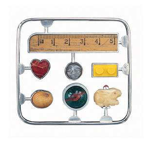
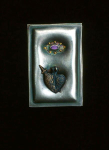
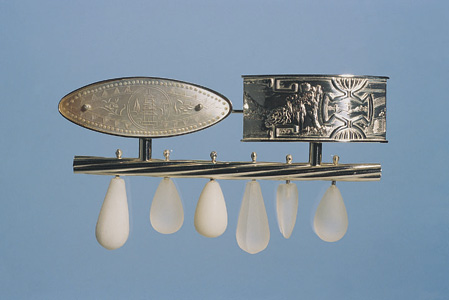
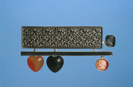
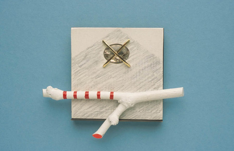
The use of readymades and found objects can present discreet opportunities. The readymade can be used explicitly to convey the intention of its original meaning; indeed this may be paramount to the narrative of the piece. For instance the Lego brick, the ruler and the glass ‘marble’ in the brooch titled Memory Kit are each evocative of childhood activities. (fig 5.1) On the other hand the inclusion of found objects, such as a fragment of ceramic plate, a twig or shell, also convey a narrative, but are of non specific origin and removed from their original context. What is presented to the viewer by the grouping of these objects therefore, is inter-connectedness, a layering of associations, simultaneously suggesting a previous history and a current meaning. A complex relationship is formed. The viewers own cognitive imagination is triggered thus presenting the opportunity to interpret the original meaning of the objects through the new context in which they are brought together. This relationship is further examined in her essay for the catalogue of Maker-Wearer-Viewertitled, Narrative and Memory by Professor Elizabeth Moignard. (appendix iii)
As mentioned previously, the stage of convergence involves a parallel studio activity whereby a wide variety of objects and readymades, fabricated or found, are arranged in a position where they can be viewed frequently. These are systematically re-arranged over a period of time during which connections and associations are made until each artefact has established something to say and found its partners. Through this process of self-authoring, of affirming the ideas, there also exists a certain lack of control during this period of creative interplay. Allowing a degree of chaos and uncertainty is a positive creative act, essential in seeking affinities and congruity in the final resolution of each brooch. (figs 5.2 – 5.17)
(figs 5.2 – 5.17)
Discussed in Chapter 3, for the past twenty years my output has concentrated, almost exclusively, on the brooch form as the vehicle to express my particular narrative. A brooch, when worn, stands alone as an object without the visual interference or distraction of a chain, ring shank or ear wires. The designing of a brooch as a free standing composition is, in my mind, not compromised as a consequence.
The issue of the brooch as something other than a piece of jewellery, was raised during the M-W-V Symposium by the delegate Barbara Santos-Shaw,
The business of scale is absolutely so important. Often the brooch is a sculpture as well, and I think, because they have to be worn on a garment, they read differently, like a relief on a building. That’s a problem, because they don’t always work. The brooch almost has a superficial quality. (Santos-Shaw 2005).
The ‘business of scale’ is certainly an important factor. In the context of how these relatively small objects can reflect on very big issues, the ‘macrocosms’ and ‘microcosms’ as expressed by Ramon Puig Cuyas, should not however be confused with the work of the sculptor. This is an issue of size, not scale, also the human body is essential to the work of the jeweller, not so the sculptor. Although there is an intellectual debate around the crossover between fine art practice and design at this juncture, my personal decision for choosing the brooch form is an aesthetic judgement.
Pockets Series
A number of simple photo-montages show that I was also seeing these forms as potentially much larger than body adornment. (figs 5.24 – 5.26)
(figs 5.18 – 5.26)
(figs 5.27 – 5.35)
Similarly, the private view invitation card for the exhibition New Work - Jack Cunningham & Anne Finlayat The Open Eye Gallery, Edinburgh (1986) states, ‘Jewellery and Constructions: Works exploring abstract qualities of shape and form. Incorporating a number of materials and techniques to achieve colour, texture and a variety of scale.’ (Cunningham 1986). (figs 5.27 – 5.30)
Despite describing these works as being ‘abstract’ and without narrative, I later came to realise that they were simply non-figurative. I remember clearly that I also felt a sense of frustration that I had not found the voice with which to express a narrative that I was, as yet, unsure of. These pieces had the intention to communicate, but the narrative was expressed as a feeling, represented an emotion rather than a story. They were in fact the very embodiment of an early narrative and were my attempts to communicate ideas through visual and physical ‘containment’.
The constructions referred to were a series of wall mounted pieces that show more explicitly, this expression of ‘growth’ and ‘emergence’. (figs 5.31 – 5.35) I had allowed the dimensions of this work to increase, however I also felt I had, to some degree, to make a choice. Should I now increase the size of my objects and work on more sculptural constructions or stay within the field of jewellery? Firstly, I did not feel driven by fine art concerns nor consider myself an ‘artist’. Secondly, I enjoyed the fact that my work was placed on the body and consequently able to move around with the wearer and lastly, for more practical reasons, my workshop was equipped for jewellery manufacture and these factors influenced my decision to stay within this arena. In time, I came to appreciate that the use of installation in my work facilitated a way to satisfy this need for an increase in size.
A seminal turning point that fundamentally changed my design philosophy resulted from a short teaching residency in 1991 as Associate Visiting Professor at Metropolitan State College in Denver, Colorado. Although somewhat on the périphérique of my knowledge, I was familiar with both the art of Frida Kahlo and the artefacts associated with the South American ‘Day of the Dead’ festival celebrations. During my visit to Denver, there was an omnipresent and quite overwhelming vogue for this work at that time. Whether down to the exuberant colour, the passion and sentiment, or indeed my own emotional response to new friends, experiences and the environment of Denver, this combination of very positive factors impacted on my consciousness quite dramatically. I set about collecting objet trouve, Milagros - the votive charms invested with powerful spiritual and healing properties, Boulder opals, and imagery to work with on my return.
The resulting solo exhibition Jack Cunningham – New Brooches mounted at The Scottish Gallery, Edinburgh during 1992, demonstrated the influence of this experience and the new direction of my work. Two changes had occurred. Firstly that my output could aesthetically be described as narrative jewellery, there was now an explicit visual narrative, and secondly I felt justified in giving each brooch a title which I might previously have considered pretentious. There was no catalogue publication for this exhibition, although the invitation card read;
His jewellery has always reflected an interest in the theme of containment: earlier work concentrated on developing a series of brooches in which abstract shapes are held or suspended in pockets or vessels of metal. The formal abstract quality of this earlier work has been superseded by a more lyrical and expressive quality. Retaining the vessel as a central element of the work, the jewellery now explores the idea of the human vessel as an embodiment of thought, memory and experience. The resulting series of brooches, built up in intricate layers of metal and semi-precious stones read like a series of tiny, narrative paintings in metal, whilst also retaining the formal concerns of jewellery. (Game 1992).
Milagros Collection
The first works in this series incorporated the actual Milagros collected in Denver, but these were quickly superseded and replaced by the inclusion of cast readymades. (figs 5.36 – 5.37) I felt these could make cultural references of a more personal nature and more relevant to my life as a European. Familial relationships are at the heart of the narrative in this group of brooches. (figs 5.38 – 5.47)
(fig 5.36 – 5.47)
Since that time, each output of work has been developed either as discreet groups related by a specific subject matter or as an ongoing series, an unending journey. I explore themes which reflect on emotional and physical experiences by commenting on personal relationships, responses to place, the environment and the recollection of memory, in addition to influence of materials and techniques. Although the work is generated from a personal perspective; my senses, my responses, my emotion - the micro, the subjects of my work extend to the macro, to the bigger picture, the fundamentals experienced by us all. The work is generally discussed in chronological order as presented through solo exhibitions although interspersed are a number of themes which are recurring and subsequent generations have therefore been produced over a number of years.
A Sense of Place – Exhibition Edinburgh/Kyoto/London 1997
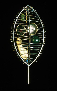
Three groups of brooches formed the content of a joint travelling exhibition mounted with textile artist Linda Green. It was also my first visit to Japan, an experience that was to hold future significance for my work. From my perspective A Sense of Place, the title of the exhibition, was a synthesis of where we can physically exist and interact externally and at the same time a place in one’s heart, the internal. It was also the name given to a group of these brooches. These works explored my personal response to a number of geographic locations and was a method of classifying or cataloguing that response. Each brooch was constructed from silver wire into the form of a leaf shaped cage. The cage had an open volume and inside each structure fabricated and found objects were positioned, and protected, which had specific relevance to the locations identified. (figs 5.48 – 5.52)
Hence, A Sense of Place – Kelvingrove contained various green semi-precious stones, to signify the greenery of Kelvingrove Park in the city of Glasgow (a place of childhood memory), and a cast sycamore seed, its flora and fauna. Dunure contained minerals and a pebble, collected or associated with that part of the Ayrshire coastline. Sanna Bay had a small ‘queenie’ shell, dried seaweed and other marine inclusions, in response to time spent in that remote, most Westerly part of the Scottish coastline. In the brooch Park City, a reference to Central Park in New York, sycamore seeds an acorn and a feather were used as a reminder of this oasis in an otherwise uncompromisingly geometric urban environment. The installation of these pieces showed the brooches suspended in front of small wall mounted house shaped panels, each white panel with a map corresponding to the location identified by the title of the brooch. (figs 5.53 – 5.57)
(fig 5.48– 5.57)
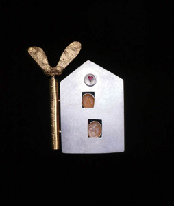
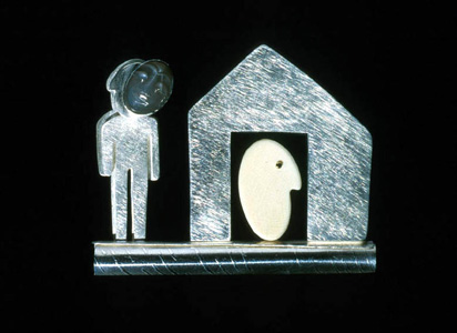
House Series
The House Series was the start of a group which continues to offer potential today. The use of the ‘house’ as metaphor is commonly used by artists and designers. It is used here to signify a sense of security, of safe haven, of sharing, of the place containing familial relationships. (figs 5.58 – 5.66) The early works were titled Love Nestand incorporated imagery such as the heart and the kiss, alongside carved moonstone faces which were free to change position subtly in response to the movement of the wearer. Three brooches titled Collecting Box took the outline of a house shape and were based on childhood recollections of collecting birds’ eggs, of the small objects and detritus we feel unable to abandon and of the people who pass across our lives, but may play no lasting part in them. The objects were positioned as though museum exhibits to be observed. A further group were simple open ‘house’ shapes with a plain interior surface, sometimes gold leafed, or with a pattern of cultured pearls, hematite beads or carved coral roses suspended across the surface. (figs 5.67 – 5.87)
(fig 5.58 – 5.87)
Love Seeds
Love Seeds was a body of pieces with the simple intention of conveying the sentiment of love. There was a kinetic element to the surface beaded wires and to the pearls and semi-precious beads on the edge of the forms. Carved tourmaline leaves and cast sycamore seeds were used to signify growth, renewal and fecundity. The sycamore seeds continued to find a place in my work over a number of years. (figs 5.88 – 5.97)
(fig 5.88– 5.97)
Journey – Solo Exhibition Glasgow/Adelaide 2000
The Journey exhibition was a large installation designed for a gallery space in the Lighthouse building in Glasgow. It travelled in a different format, for practical reasons, to the Jam Factory in Adelaide, Australia. The context of the exhibition was concerned with the journey we take through life, the decisions we ultimately make and the resulting consequences. In the catalogue statement I wrote, ‘By exploring personal journeys through literal narrative, these new brooches seek to evoke empathy from the wearer and viewer which is both illuminating and empowering.’ This position was reiterated by a review of the exhibition by maker/researcher Ann Marie Shillito, when referring to the materials incorporated in the work,
Their containment within the forms and symbols he uses – the crosses, hearts, house-shapes and beams – evokes a growing empathy which is grounded in universal interpretations of icons and allegory. The quirky added elements…encouraged me to interpret each piece and to delve deeper into Jack’s thought-provoking process. (Shillito 2000: 10).
The installation for Journey was designed around the ‘house’ shape. These were either solid forms on which were mounted the group titled X Marks the Spot, or small glass structures, vulnerable and transparent, yet protected and secure. Positioned against a floor to ceiling glass wall, the glass-houses afforded the viewer a totally unrestricted view across the city’s skyline, increasing this sense of fragility. They were each mounted on red and black striped poles, markers, and then on a base with wheels giving each piece the potential to be moved or pulled freely, to journey. (figs 5.98 – 6.6)
(fig 5.98 – 6.6)
The Kit Series
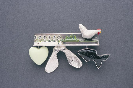
The Kit series was based on the childhood activity of building plastic models by snapping off, and gluing together, the small parts secured on a moulded plastic frame. (fig 6.7) These Airfix kits were commonly associated with fabricating together warships, aircraft bombers, tanks and vehicles, and so on. I wanted my works to convey the possibility of constructing sentiments of love, relationships, emotions and feelings. Therefore the Love Kit series and Season Kits used imagery as metaphor to imply that we could snap these parts off and construct a bigger picture than the sum of the parts suggest. They imply active participation, of selecting, of wanting to make things work. (figs 6.8 – 6.18) As mentioned previously Memory Kit explored, through the trigger of the object as metaphor, memories and activities associated with childhood; the repetitive constructing of larger objects from small Lego pieces, the carved rabbit remembered as family pet, the shell as summer holidays, the ruler remembered as school and the passing of time.
(fig 6.7 - 6.18)
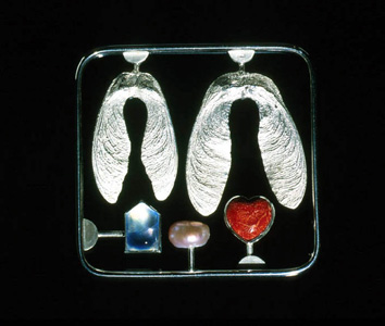
A small number of pieces, four in total, constituted the group Crossing and Family Tree. The particular narratology of this series of brooches speak of our most profound voyage, of life and of death. Although they speak of bereavement, they are hopeful and optimistic and the physical making of them was cathartic to my own feelings of loss at that time. These memento mori refer to my own family, of my parents and siblings, of what was, and what is. The ‘Family Tree I & II’ pieces are a mapping of this past and present, the small carved moonstone faces representing each family member. In ‘Family Tree I’ there is an empty stem, projecting from a central branch, which appears cut, the ‘face’ gone. It signifies a loss, that of my sister. The branch is cut, the tree goes no further.
During September of 2001 I had arranged to instruct a group of secondary teachers during an in-service day in the jewellery department of The Glasgow School of Art. The theme of the workshop was exploring ‘self’ as source for developing design ideas. The date of the workshop although not significant, was certainly poignant - 9/11, and news of that day’s atrocity was circulating towards the end of the teaching session. During a break period I invited a small focus group (5) to examine one of my brooches, ‘Family Tree I’ and record their response to a set of questions. I did not disclose the title of the piece until they had completed question 1:
1. In your own words describe what the brooch means to you.
2. Supplied with the title of the piece, is your response to the piece different to your answer above?
3. Has your perception of the piece altered by knowing the title?
4. Has it (the brooch) triggered a memory of your own?
The imagery of the brooch is fairly explicit, its intention as a memento mori less so. All five responses to question 1 picked up on the general theme of the brooch;
“Organic, growth, birth of children, stages of life.”
“It is a tall tree…when you look closer you see something other than the simple stones – faces.”
“Identity – within a group – a bond – growth.”
“The carved stones have a spooky quality.”
“Interesting because of the stones and then on closer inspection the carved heads. Like simple branches.”
Once given the title, the response to question 2 is mixed. Three respondents felt it did not alter their perception of the brooch and their initial response remained the same. Their answers to question one had adequately explained how they felt about the brooch and the title endorsed their statements rather than challenge it. One respondent did feel a significant shift on knowing the title; “Of personal value to the designer but could also relate to the wearer, children. I think the brooch has taken a more personal value knowing the title.” This, in part, answered the final question and was shared by all respondents. Each person could relate the significance of the brooch to their own life experience, through the imagery of the artefact a memory was triggered;
“It reminds me of my parents…kind of ironic as my Mother would never have worn anything so avant-garde.”
“Yes, being a teenager! It will trigger memories for everyone.”
“In a sense yes, the family, my children.”
From the analysis of this material I could elicit that the title, while a useful prompt, was not essential if the imagery was strong. More significantly, it demonstrated that a connection was made between the viewer and the object, through their ability to personalize it and find meaning through their own memory. (figs 6.19 – 6.26)
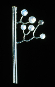
Brooch 2000. white metal, rainbow moonstone
These brooches are further discussed from the perspective of the wearer/viewer by Elizabeth Moignard in her essay Narrative Jewellery and the Wearer for the catalogue Jack Cunningham – On the Line. (appendix iv)
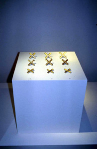
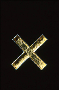
X Marks the Spot
X Marks the Spot are pieces which are the least explicitly narrative I have designed, but perhaps among the most wide ranging in concept. Hollow, box constructed cross forms were lined with gold leaf, set with cross shaped cultured pearls or with willow twigs. The imagery comes from my observation and recording of visual markers and indicators and I describe these works in the exhibition catalogue as ‘Stating a claim, whether a kiss, a ballot paper, the Saltire or a potent religious symbol. Throughout life we make decisions which are clearly marked, our fate often sealed by a signature, the state of a nation determined by the placing of an X.’ (figs 6.27 – 6.40) The figurative artist and collector Lys Hansen wrote to me on acquiring one of these brooches in 2004,
(fig 6.27 - 6.43)
My response to this work was that it immediately reminded me of an underground passage in the recently built iconic Jewish Museum in Berlin, designed by the architect Daniel Libeskind. The overhead lighting at the cross-over, forms an illuminated cross to light the way. It is a beautiful piece reminiscent too of the Scottish Saltire, with the human form (cultured pearl) caught within its human condition. (Hansen 2004).(figs 6.41 – 6.43)
Hansen’s description corroborates my intent that the X acts as a marker or the Saltire and takes it to a new level of interpretation through her own frames of reference.
Mask
The brooches titled Mask continued the theme of the earlier House series. Two dimensional figurative shapes were layered and juxtaposed against carved moonstone faces and placed outside the construction of a house. Inside the house, is seen another profile of a head. (figs 6.44 – 6.46) The narrative of these pieces suggest that we have many different facets to our personality, that we respond and behave in a different manner depending on the differing formality of the circumstances, including where we are, and who we are with. A face for family, a face for the work place, a face for our friends. We prepare the face to fit the situation to meet the people we meet. The house, or home, where we can truly be ourselves, is perhaps a more constant and private environment.
(fig 6.44 - 6.46)
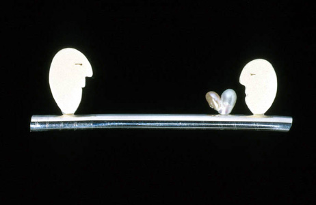
Balance
The brooches in the group titled Balance reflect on the choices and ultimate decisions we make at defining moments in our lives. (figs 6.47 – 6.51) A sort of right of passage, the pressure we feel in making the right choice in matters such as religion, relationships, partners, and how the consequences of our actions affect others. As two children on a see-saw, life experiences often require faith and trust in others.
(fig 6.47 - 6.51)
Jerwood Applied Arts Prize
Shortlisted for the Jerwood Applied Arts Prize 2000: Jewellery, I selected a group of works from the Journeyexhibition to show at the Crafts Council Gallery in London. (fig 6.52) This work was peer reviewed by writer and critic Ralph Turner, ‘Jack Cunningham confronts narration (much like American Goldsmiths) with vigour, using found objects, and culls from old jewellery – such as cameos.’ (Turner 2001: 50). During the summer of 2001 I showed a further body of work with the Crafts Council at the V&A, London in a solo exhibition Jack Cunningham: Jewellery. This too was reviewed by Turner, ‘The more restrained designs worked best, including a series of gold-leaf cruciform brooches with sticks of willow carrying ecological messages and cultural pearls erupting into full-blown figurative fantasies.’ (Turner 2001: 64). Here Turner was referring to the series X Marks the Spot, his ‘figurative’ analogy echoing the earlier description by Hansen.
(fig 6.52)
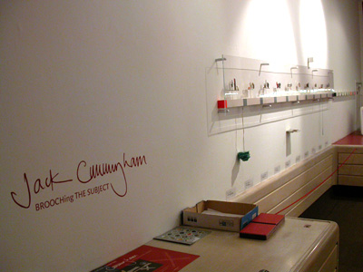
Brooching the Subject - Travelling Gallery 2003
For the Travelling Gallery exhibition, Brooching the Subject, reflective practice was at the core of the installation. My exhibition was in part, a retrospective based on the presentation of my particular work process, showing sketchbooks, source imagery, an interactive CD Rom, in addition to contextualising new brooches based on Japan and Paris through related found objects. The exhibition of 20 brooches, mounted in a customised double decker bus, was to tour for four months to more remote parts of Scotland or to disadvantaged areas of our inner cities and was primarily aimed at a tertiary and secondary education audience. (figs 6.53 – 6.57)
The comprehensive tour began in East Lothian, travelled through Glasgow to the north of Scotland, on to Shetland, returning down the west coast to Ayrshire and Isle of Arran, the Borders and back to Edinburgh. The relaxed atmosphere of this unusual space allowed for a more intimate interaction with the objects. The title of the exhibition, Brooching the Subject was a simple play on words, the brooches broaching the subjects’ central to the exhibition.
(fig 6.53 - 6.57)
Japan
As mentioned previously, I had by this time visited Japan on several occasions, exhibited there, lectured and, in Tokyo, presented jewellery workshops at Bunsai College of Art. I had also acquired an apartment in Paris and was spending all available vacation time in that city. The culture, environment and atmosphere of both locations had become increasingly seductive, had gotten under my skin. This manifest itself in bodies of work that focussed on my response to these very different places.
In Japan, the influence of place and the infrastructure of a new location can, at first, be an overwhelming experience. It takes time to absorb that instant hit, the culture shock that awakens the senses; the smells and tastes, the quality of light, the shapes and imagery, the sounds and customs, which alert you to the possibilities of stepping out of your more familiar zone. As a society it is simultaneously bizarre to Western eyes, almost extreme in terms of dress code and behaviour, and at the same time this uniqueness is refreshing and most welcome. No Gothic architecture here, no Greek Classicism, the eyes are struck by the juxtaposition of the neon mega-metropolis and the temple. (figs 6.58 – 6.91)
There is a strong almost oppressive conformity, where unseen small armies ensure there is no litter or dirt on the streets, anywhere. Yet the plain fact is that people simply don’t drop litter, ever. And politeness is elevated to such a level that the Parisienne custom of the perky ‘bonjour’ and ‘merci, au revoir’ as you enter and depart a shop, is reserved compared to the cries of ‘ohayoo gozaimasu’ ‘arigato gozaimasu’ that greet you at every opportunity. The series called Japan attempts to convey a certain interpretation of my impressions of Japanese culture. The resulting work being a construct of the culture, as I have observed and recorded it, intermingled with my representation of that culture. (figs 6.92 – 6.99)
(fig 6.58 - 6.99)
Two brooches Nijo-jo and Osaka-jo each pertain to the castles of Kyoto and Osaka, ‘jo’ being the Japanese word for castle. In Nijo-jo reference is made to its location, identified through a small map set under a rock crystal cabochon. The two small birds signify the starling floor, a wooden floor laid in the outer quadrangle of the castle. When the floor is walked upon, the resulting sound of the boards flexing against each other imitates uncannily, a screeching flock of birds, and was designed as an early alarm system against invaders. The tableau is a willow pattern motif, the scene evocative of ‘Cherry Blossom Sunday’, the springtime ritual of picnicking under cherry blossom trees. In A Zen Thing the hanging semi-precious stones are a reference (as in Osaka-jo), to the lanterns which hang outside traditional restaurants and small bars. These are lit at night and move gently in front of short curtains that obscure one’s view of the interior. The engraved mother-of-pearl fish and the use of coral evoke the Japanese love of Zen gardens incorporating small pools containing coy carp, sometimes no bigger than a basin and often sited within the entrance garden or courtyard of a home.
The brooch titled A Very Japanese Thing incorporates the image of a low house form in bamboo, the ‘hanging lanterns’ are carved coral beads and a readymade in the form of a Japanese character named Nova Usagi. As Bailey puts it, the ‘ Japanese flair for miniaturisation’, also extends through Manga art to their love of tiny, rather dinky, cartoon like toy objects. These playful objects hang in clusters from mobile phones, bicycles, key-rings, bags, etc, in order to personalise in a country so densely populated. Nova Usagi (usagi is Japanese for rabbit), is, ironically, the logo for an English language school in Tokyo and was literally a found object, ‘found’ when out with some Japanese academics for dinner one evening. The brooch is both a reminder of that evening and a reflection on Japanese society.
During a visit to Japan in October of 2004, I delivered a keynote lecture in Tokyo to the first year students of Hiko Mizuno College of Jewelry. Also open to the public the lecture attracted an audience of over 640 and was consequently held in the National Olympic Youth Stadium to accommodate this number. Using an illustrated PowerPoint, I spoke about the work produced by my students at GSA, my own personal practice and showed images of work by participants in the Maker-Wearer-Viewer exhibition, which was to open the following Spring. There were some interesting questions from the floor at the end of my talk, but the most pertinent to this research was asked by a student who wanted to know why the work she had just seen was so different to the work they produced in Japan. The question itself supports earlier findings in my text under global paradigms. My answer sighted cultural differences, exposure in the West to a long tradition of jewellery making and our differing educational systems. Relatively speaking, it is still the case that little work from outside Japan is exhibited there, thus restricting exposure to contemporary trends. And although there are excellent catalogues and publications available, few are yet translated into Japanese.
Paris
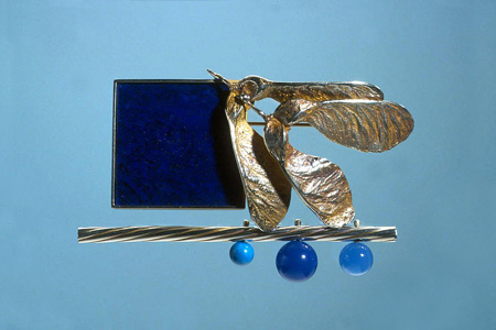
The Paris series was quite a different output to that generated through my experiences of Japan. (figs 7.0 – 7.5) A city different in so many ways to the city I most commonly live and work, Glasgow, I am however a European and as such there are certain familiarities. This group of brooches became a way for me to identify what was different between my lives in Glasgow and Paris, and what emerged was a sense of freedom and the opportunity to explore another sense of me, another mask. For example the brooch titled Midnight Blues is not melancholy, but a reference to visiting late night jazz clubs which are extremely popular and abundant in Paris, but uncommon, almost unthinkable in the West of Scotland. The deep blue colour of the lapis lazuli is metaphor for the mid summer sky at night, a twilight zone, never quite dark, and the sycamore once again representing the ability to grow, change and renew oneself. In the Garden and Summer House convey time spent living in this different location, the grand parks and city gardens sometimes hidden from view, that offer tranquillity for those living within such a densely populated urban environment. (figs 7.6 – 7.27)
(fig 7.0 - 7.27)
Brooching the Subject - Questionnaire
There were approximately 8,000 visitors to the exhibition during its run, with workshops and talks scheduled into the school curriculum at different venues. A short questionnaire was periodically given to random groups visiting the gallery and at the end of the tour I received 329 responses, together with a further 6 which I considered spoilt. I had asked 3 questions;
1. Which brooch do you find most interesting?
2. Describe what you see.
3. What does the brooch make you think of?
Also, What age are you?
The general age range of respondents was between 7 and 22 years although 9% did not answer this question and 6 were aged between 27 and 75 years old.
I wanted to elicit which brooch or brooches these young people responded to with the greatest frequency, and why. Also, how they were ‘read’ and whether they had a sufficiently developed frame of reference to stimulate, as viewers, their own narrative.
With this considerable return I was able to extrapolate that strong visual narrative is more interesting to the viewer than less defined imagery or pieces with fewer elements or visual cues, and that a more explicit narrative communicated with and engaged the viewer on different levels. Respondents were incredibly perceptive in their observations, with well articulated answers and insightful responses to the titles, materials and compositions in addition to their objective understanding of the narrative. The written responses also suggested that visitors to the exhibition had made connections between the brooches and the supporting material - the primary source and contextualising found objects.
Together with the title, the imagery also triggered a more personal recognition which, regardless of age, demonstrated that imagination, memory and life experiences are a fundamental means of interpreting an object. Although the younger viewers gave shorter answers to the questions and their language more simplistic than those in their late teens and early 20s, they were no less valid or perceptive in describing what they saw and what they thought.
The highest number of responses was accumulated by those brooches that incorporated a variety of explicit visual elements in addition to a meaningful title, or one open to interpretation. Conversely the 5 most popular brooches attracted 149 responses, being 49% of the total. In order these were; Wild Garden (34), Midnight Blues (32), Pegasus (31), Mask (27) and Long Hot Summer(25).
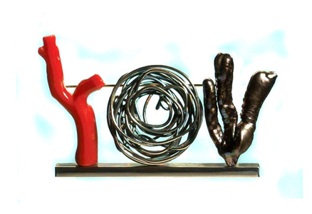
With such a high number of responses I have selected as an exemplar the brooch that elicited the largest return, to illustrate the range of responses. Wild Garden was, for me, a direct reference to the courtyard at the rear of my apartment in Paris. It is a small space which the residents have ownership of, but which no one takes responsibility for. I believe that the permanent residents rather enjoy its wild natural appearance and is therefore left to do it’s own thing. The space is dominated by a large, handsome tree which produces spectacular lilac blossom on tall spikes in the spring – as yet I have not been able to identify the species. Under the tree are shrubs and bushes, wild strawberries and architectural plants that have either seeded quite naturally or been planted many years previously. The brooch is constructed from silver rod with coiled and oxidised silver wire and incorporates a piece of branch coral and an unusual organically formed cultured pearl. (fig 7.28) The combination of materials has an exotic feel and the narrative is a simple interpretation of this private place. Given that no one completing a questionnaire could have seen this courtyard, almost all respondents made accurate description of either organic subject matter or, understandably, aquatic imagery, for example; ‘garden’, ‘jungle’, ‘sea’, ‘exotic plants’, ‘forest’, ‘desert’. The coiled wire in the centre prompted one 15 year old respondent (no 26) to liken it to ‘tumble weed’ and another (no 19) referred to the pearl as ‘seaweed’, which it does indeed look like. Two returns (nos. 8 & 9), perhaps friends completing the forms together, described the brooch as a ‘word’ which made them think of the word ‘you’. The combination of shapes does look remarkably like the word ‘you’. Response no 15 is the most accurate in terms of my frame of reference and nos. 29 and 30 have each re-interpreted using their own frame of reference. (appendix v)
The exhibition was reviewed by writer Elizabeth Cumming for Crafts magazine. It endorses the view that the narrative jewellery object, together with the title, assists the viewer to position the work somewhere between the intentions of the maker whilst melding this with a personal memory.
This is wonderfully human jewellery… Cunningham tells stories that are essentially his own but to which we can all relate. This was a show that made you think, not just about the purpose of body adornment but about a potentially vibrant relationship between experience and making. (Cumming 2004: 63).
Trophy Project
During 2002 I was invited to submit designs for a trophy, a deviation from my normal production of brooches. I was subsequently awarded the commission to produce trophies for the ARTS & BUSINESS SCOTTISH AWARDS 2002. The purpose of these annual awards is to ‘recognize and encourage business support for the arts in all its various forms’. The criterion for the design of the trophy was to reflect this statement by the Director, Barclay Price. In addition, the brief requested that it, ‘be a high-quality art object in its own right’ and ‘should preferably be of a contemporary nature – though accessible to those with no professional expertise in contemporary art.’ (Price 2002).
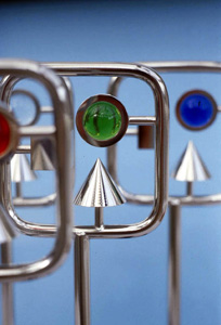
I participated in this project as I felt confident that I had ideas that would benefit from being scaled up without losing the integrity of their original concept. I based the design development on my Kit brooch series and approached the design of the trophy as if I were designing a large brooch, whilst addressing the criterion of the brief. As previously described these brooches take the form of various elements contained within a framework and appear as though they may be snapped off and re-assembled to form a larger ‘picture’ in a different composition. For the A & B trophy, three elements were used within the format of a square frame and I intended that they represent success – hence Success Kit. (figs 7.29 – 7.30)
(fig 7.29 - 7.30)
In order that the piece had the 'look' of a trophy, the frame was mounted at the top of a rod with a square steel base for stability, giving it both the visual and physical weight associated with receiving an important award. For the recipients, I wanted the trophy to have prestige and be capable of being 'read' by the Arts & Business community as an award for achievement.
The three basic design elements, the circle, the cube and the triangle were employed in three-dimensional form. The materials used were nickel plated brass rod and glass.
- The circle, as a semi-spherical coloured glass prism represented vision or future vision.
- The square was a solid cube and symbolised foundations, stability or building block.
- The triangle was a solid cone and had the symbolic value of pinnacle or achievement.
With the permission of A & B Scotland, I used this as an opportunity to the gauge response to the design of the trophy from the successful recipients. The short questionnaire was designed to ascertain, through qualitative content analysis, how the design of the A & B trophy 'read' visually to an audience who may or may not have prior knowledge of my work, and to what extent their response meshed with my design concept.
The questions were:
- In general terms, how would you describe the overall design of the A&B trophy you have received?
- How would you interpret the three elements at the top of the trophy?
- - The prism
- - The cube
- - The cone
- In words and/or an image, how would you describe or represent ‘success’?
- Does the trophy design adequately reflect your own success?
Recipient Questionnaire Results - (appendix vi)
Of 16 questionnaires mailed out, there were eleven responses. The questionnaires were colour coded to indicate either a Business company or an Arts organisation, otherwise the responses were entirely anonymous. My intention in separating the Arts responses from those of the Business community was to gauge whether any significant difference emerged from the two groups. Five were received from the Business community and 6 returned from Arts organizations.
81.8% were positive in terms of the overall concept of the design. One respondent referred to the elements as "…like they are part of an air fix model before it is broken down and assembled."
72.7% demonstrated that the symbolism behind the three forms meshed closely with that intended, with terms such as "vision", "pinnacle", "structure", "growth", "stability".
Of the five Business replies, 80% agreed that the trophy adequately reflected their own success, against 66.7% of those returned from Arts organisations. Perhaps the lower percentage from the Arts organisations reflected the perception that these recipients could design a trophy more to their own liking, with comments such as "Personally do not like the juxtaposition of the different shape", and "Not very feely touchy, warm and fluffy". Although there was little significant difference between the responses of the two groups, the analysis did demonstrate that the trophy design successfully communicated the intended narrative to the recipients.
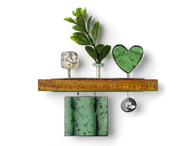
Relationship Series
In the brooch Simul et Singulas (Together and Alone), I confront the fact that we come into the world alone and leave it alone. (figs 7.31 – 7.38) As a species we instinctively wish to be partnered through life’s journey, therefore the cameo and intaglio heads are facing their adjoining hearts though separated by a certain distance. In How Deep is your Love? the viewer is invited to consider the question from two angles; a question that we ask of ourselves, how deep is one’s love for another, or alternatively a question to pose, how deep is that person's love for you? The ruler acts as a sort of dip stick, as if it were actually possible to measure love and give it a score. In the brooch Where Now? the house shape is a reflection on how our past movements can be identified and marked, rather like a family tree, and ultimately begs the question, where do we go from here? Pegasus was designed following a trip to New York. I had visited the Metropolitan Museum and among the exhibits of South American artefacts was a curious gold exhibit which the Museum curators had not been able to identify in terms of its purpose or meaning. It was a small hollow formed gold figure in a prone position, approximately 15cm long, which appeared to be soaring or flying. As art can so often do, this amusing piece seemed to lift my spirits and symbolise the success of my visit to New York. The brooch depicts myself soaring as a winged being. Out of the Box shows a carved head, myself, outside a box containing a small carved skull – the box being a place that kills creativity, individuality, expression. The skull rotates and has a second skull image on the reverse. It is suggesting that we must step out of the box of conformity in order to flourish and grow as individuals, hence the cast sycamore seeds dominate the piece.
(fig 7.31 - 7.38)
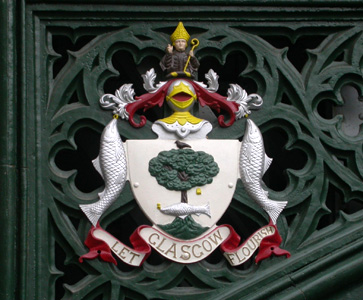
Dear Green Place
Dear Green Place is the title given to a group of four brooches all with the same theme, that of interpreting in a light-hearted way, the Glasgow Coat of Arms and motto - Let Glasgow Flourish. The title Dear Green Place is a common Glaswegian description of the city and refers to its abundant parks and tree lined terraces. (fig 7.39) It is attributed to writer and critic Daniel Defoe following his visit to Glasgow in the early 18th Century. Assembled mostly from readymades, they reinterpret the four emblems of the coat of arms as traditionally described in the rhyme:
Here’s the bird that never flew,
Here’s the tree that never grew,
Here’s the bell that never rang,
Here’s the fish that never swam.
(fig 7.39)
As these brooches are an interpretation of existing imagery, a re-arranging of previously known material, it could be said that they demonstrate limited creativity or originality. I would argue that an act of creativity is just that, the bringing together of previously known information, making connections, and generating a previously unknown outcome as a result. Dear Green Place as I have designed it, is a demonstration of creative thinking. (figs 7.40 – 7.44)
(fig 7.40 - 7.44)
The Glasgow Brooch was a commission to design and manufacture a piece that would celebrate the city and also act as companion to a brooch in the Dear Green Place series. The process involved consultation with a third party (the person commissioning the piece as a gift) during which, discussion centred on the presentation of visuals, samples and materials that may be included. What became important in this instance was that if the third party felt the brooch communicated, in visual terms, a Glasgow vernacular, the wearer would also. Visual references include the river Clyde, the green spaces of Glasgow, the landmark ‘armadillo’ building, the Finnieston crane and the city’s industrial past. The Glasgow Brooch achieved a successful outcome for all concerned, the maker, the wearer and the viewer.
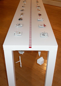
End of the Line
This exhibition returned to Glasgow and was renamedEnd of the Line (Roger Billcliffe Gallery 2004), signalling the final showing of this body of work. (figs 7.45 – 7.46) The installation took the form of one long table, marked down the centre with a red and white striped line, a linear marker. Hanging underneath each brooch was a familiar everyday object, painted white to neutralise its definition. As with the artefacts used in the installation of the exhibition Brooching the Subject, these objects were related to, and contextualised, the brooches.
(fig 7.45 – 7.46)
Pére Lachaise
A small group of new brooches were added to those shown previously. Titled Pére Lachaise, these explored imagery sourced at the cemetery of that name in the 20th arrondissement to the north-east of Paris. (figs 7.47 – 7.63) The atmosphere one feels when walking around the signposted ‘streets’ of Pére Lachaise seems dependent on two factors, the mood one is in at the time of the visit, and the prevailing weather conditions. The architecture of the crypts can be oppressive during the heat of summer, while the overblown gothic detailing of the structures somehow mock the dead therein. During a cold winter’s day, the crispness of the air can somehow raise one’s spirit rather than depress. It is a theme I intend to return to in the future perhaps recording my pathway through these ‘streets’ during each of the seasons of the year and using this imagery as the basis for an installation.
(fig 7.40 - 7.44)
Whether so called creative individuals have an intuitive instinct or innate ability is debatable. What is certain is that creative problem solving, as described through my personal practice, requires a driven, searching approach to information gathering, a strong sense of enquiry, and the ability to make connections.
Reflexive Practice – Future Themes
Designed as compositions of readymades and fabricated items, Fragments is a new series of brooches exploring a more free association of randomly selected found objects. (figs 7.64 – 7.67)
(fig 7.64 - 7.67)
Fragments
The series has emerged from an earlier group of works which were designed as small single-image pins that were intended to be worn in groups, connected physically (on clothing) and cognitively, by the wearer's own narrative. Although these were favourably received by a gallery audience, they were not read in this way, the potential to wear more than one at a time was not recognised. For the series Fragments I changed my approach by bringing together these single images, by inviting the viewer/ wearer to make his or her decision as to their meaning and the connection each element on a brooch makes with the others. Despite these pieces having no particular storyline per se, it is still my ‘overt intention to communicate to an audience’; by passing ownership of the narrative to the wearer. The title is deliberately open to interpretation, ambiguous even, perhaps suggesting fragments of relationships, of society or snapshots of place. The design of these brooches has not evolved from the narrative, rather it is intended that the narrative will evolve through the wearer/viewer and their response to the composition. At the time of writing, these works have not been exposed to an audience, but it will be interesting to monitor their impact in the future, what narrative will emerge?
There is a further body of work I have identified for future consideration as an exhibition installation. It stems from a biblical passage that was read at the funeral service of a close family member. This powerful and moving text cannot fail to stimulate equally strong imagery, its sentiment perhaps conveying greater pertinence and resonance in today’s society as never before.
Ecclesiastes: Chapter 3 verses 1-8. The New English Bible.
3:1 ‘For everything its season, and for every activity under the heaven its time:
2 a time to be born and a time to die;
a time to plant and a time to uproot;
3 a time to kill and a time to heal;
a time to pull down and a time to build up;
4 a time to weep and a time to laugh;
a time for mourning and a time for dancing;
5 a time to scatter stones and a time to gather them;
a time to embrace and a time to refrain from embracing;
6 a time to see and a time to lose
a time to keep and a time to throw away;
7 a time to tear and a time to mend;
a time for silence and a time for speech;
8 a time to love and a time to hate;
a time for war and a time for peace..